Visualizing an Interdisciplinary Research Agenda
An interactive, exploratory display designed for large-scale presentation at in-person events
.png&w=1920&q=75)
For this project, I designed and coded an interactive large-scale display that transforms a complex research agenda into an explorable visual experience.
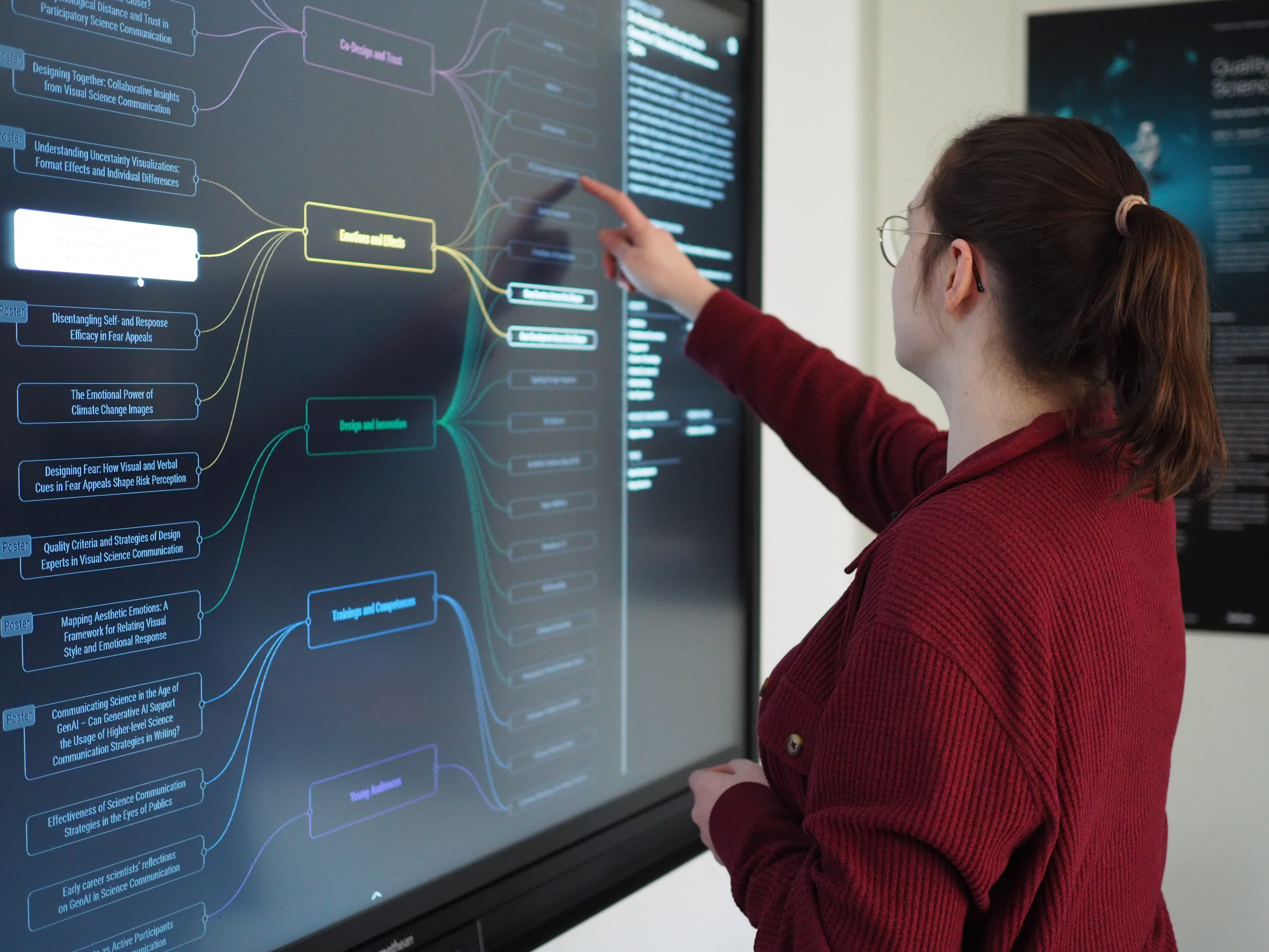
The goal was to move beyond static, printed posters and create an informative and engaging interactive visualization for in-person events, like conferences and stakeholder meetings. Visitors can explore research areas, filter studies and products, and discover connections between topics through direct interaction on a touch screen.
2025/2026
Kiel Science Communication Network (KielSCN)
Standalone Interactive Visualizations
Concept, Design, Development, Testing
Concept & Design: Figma; Frontend: React Typescript with D3.js on Vite; Backend: Express Server with GraphQL & Prisma using Supabase; Vercel
Thanks to Björn Döge for showcasing the interactive poster
I started with a large dataset for a network visualization comprising 200 nodes and 600 edges with 17 different node types. First, I created a concept for this project to align on the project goals and potential visitor questions. Keeping this in mind, I drafted the data model, reducing the displayed information to the most relevant aspects (research area, study, and product), while still allowing for context and filtering by defining everything else as labels.
During the wireframing phase, I defined the necessary views and interaction methods (main view, detail view, etc.). After receiving client approval, I moved on to creating the visual design, which was inspired by the client's Pinterest board and an existing color palette for the accent colors.
During development, I decided to use GraphQL with Supabase on the backend to enable fast and dynamic filtering and querying. I coded the frontend using React and D3.js.
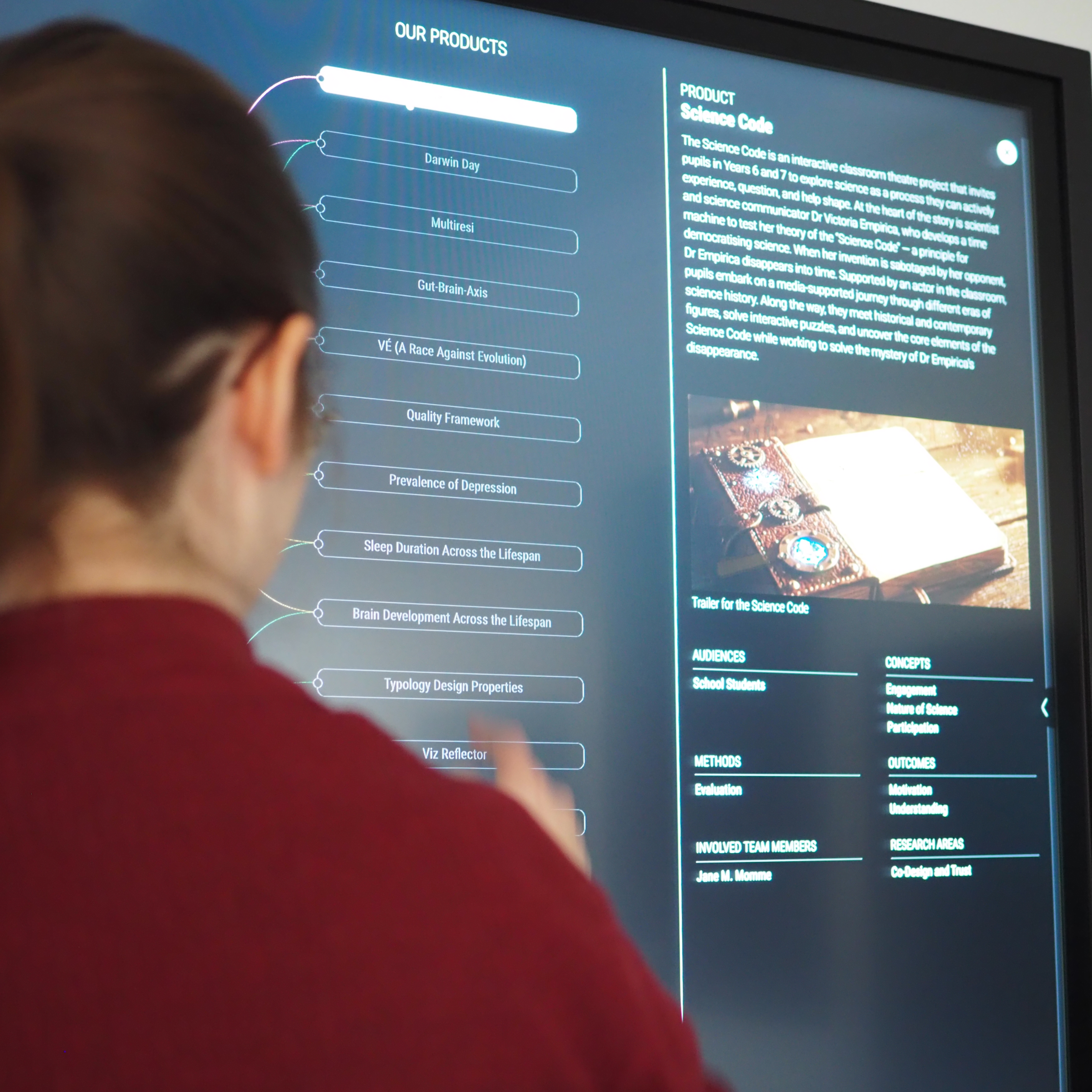
The final website is displayed during in-person events on a large 55'' touch monitor to showcase the extensive research of the Kiel Science Communication Network.
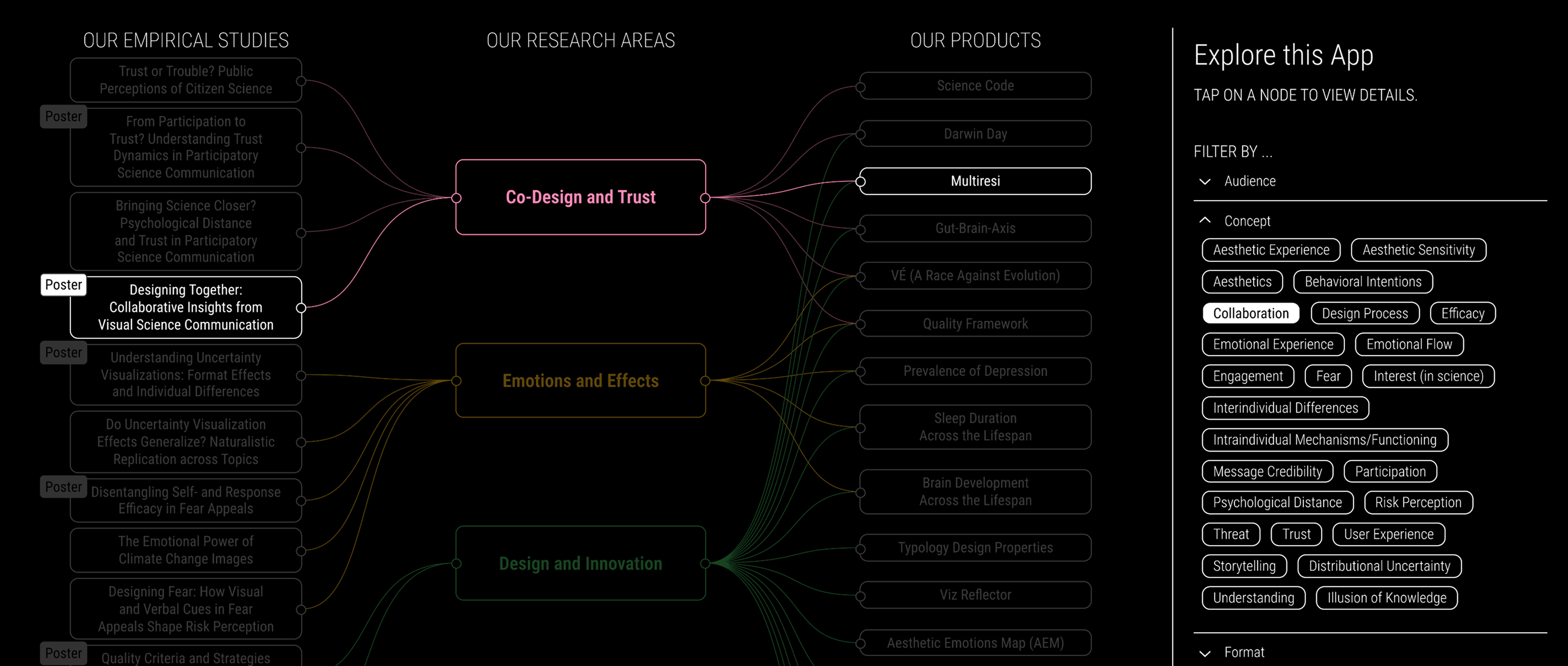
Clicking on a filter highlights all research areas, studies and products tagged with the filter, here e.g. "Collaboration"
This project comprised a few very interesting challenges:
- Concept & Data Analysis: Condensing the given dataset into the most relevant views for visitors.
- Wireframing & Design: Using the available screen space wisely to fit everything in.
- Development: Testing the website and its interactivity without a touchscreen monitor of that size in my home office.
- Data & Content: Create the database so that the client can edit the content independently.
I am happy with the result and would love to create more of these interactive posters in the future.
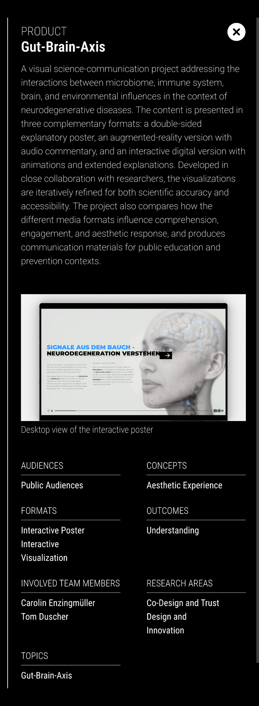
Detail view of a product, including media assets like videos and images
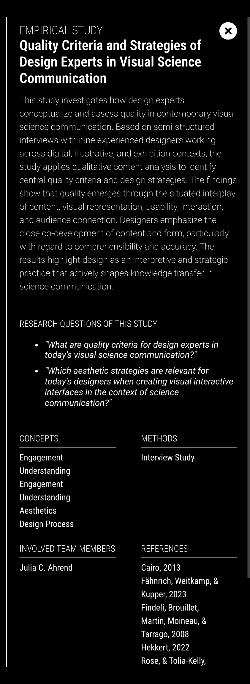
Detail view of an empirical study, incl. research questions of the study
See also
More Projects You Might Like
Inspired by what you see?
Let’s discuss how we can bring your data to life with a custom, interactive visualization.


